HERZFLIMMERN
ABOUT
"Herzflimmern" is a studentsproject wich overhauls and improves the
users
interface an
experience of an medical web application for treating and monitoring heart diseases.


ANALYSING PROBLEMS
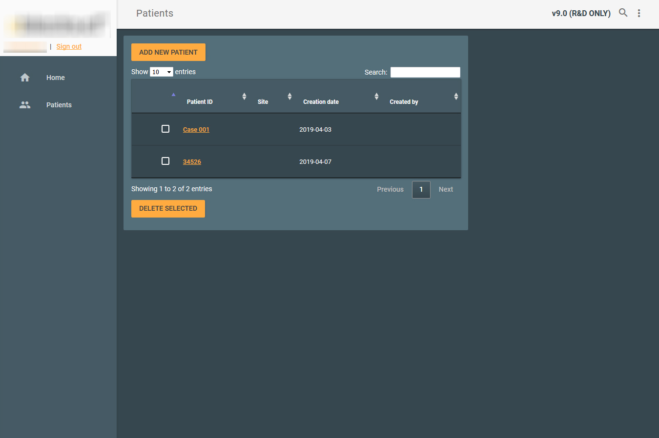
Before starting to redesign, the first step was to test and tryout the
web
application. While testing the application, it is important to take notes and write down possible
solutions and ideas in a brainstorm like session.
It is key to make a flowchart of the application, to visualize where excess interactions and such occur.
It is key to make a flowchart of the application, to visualize where excess interactions and such occur.
RESEARCH QUESTIONS
After narrowing down the potential problems, a paper based prototyp was build for validation. With the
help of
personas, the protoyp was used for testing with the following research questions. Those questions are
split two
different issues: usability and navigation.


TARGET GROUP
As one can see from the personas, the only users for this application, are
nurses and
doctors. For the user test nurses and doctors from the "Uniklinikum Augsburg", wich fittet the personas
quite well, were volunteering to participate in testing the prototype.
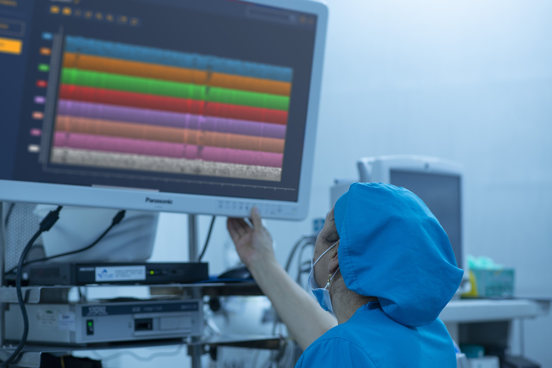
CONTEXT OF USE
As this application is mainly used in medical surroundings, the
application
had to be used in different light and stress scenarios. In the operation rooms for example, the screen
would
usually be two times further away from the user then in a office environment. Therefore the web
application
has to be designed with a bigger emphasize on contrast and readability.
NAVIGATION
USABILITY
Do testpersons use the implemented shortcuts on the dashboard?
Do they navigate directly into a patient´s file from the dashboard?
Do they use the inspector to open the maps?
Do they use the breadcrumbs to jump back one or more sites?
Do they navigate directly into a patient´s file from the dashboard?
Do they use the inspector to open the maps?
Do they use the breadcrumbs to jump back one or more sites?
Are testpersons able to find certain informations easy and fast?
Can they find out the diagnosis of a patient?
Can they open the maps and handle the comparison tool?
Can they find out the diagnosis of a patient?
Can they open the maps and handle the comparison tool?

TESTING AND EVALUATING
Test Methods
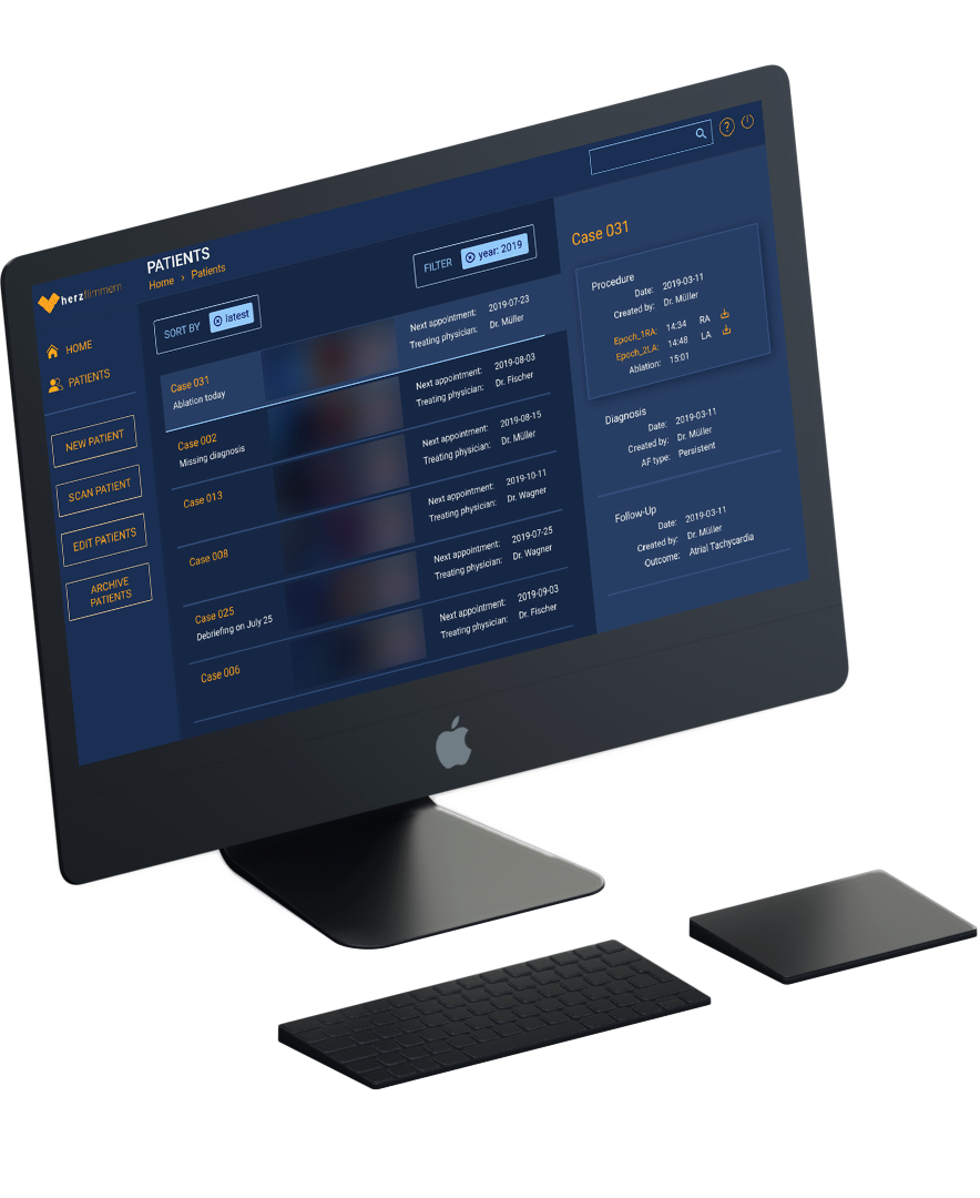
After narrowing down the problems, a prototyp was built with figma. It
solves the
biggest issues in the navigation by simplifying the interface and added breadcrumbs to furthermore
streamline the navigation though the web application.
To ensure readability in any environment, a styleguide was formed with the highest possible amount of contrast in mind. This prototype was then used for testing and evaluating the improvments of the interface.
To ensure readability in any environment, a styleguide was formed with the highest possible amount of contrast in mind. This prototype was then used for testing and evaluating the improvments of the interface.
Test Scenario
Half of the tests were done in a treatment room at "Uniklinikum Augsburg". Two laptops were placed in
front of the test person. One with the prototype and the other with the tasks on the screen. Laterally
in front of the test person cameras were placed to film each persons reactions. The other half of the
tests with the paramedics followed the same principles and were performed in the rescue central in
"Gräfelfing".
EVALUATING USERTESTS
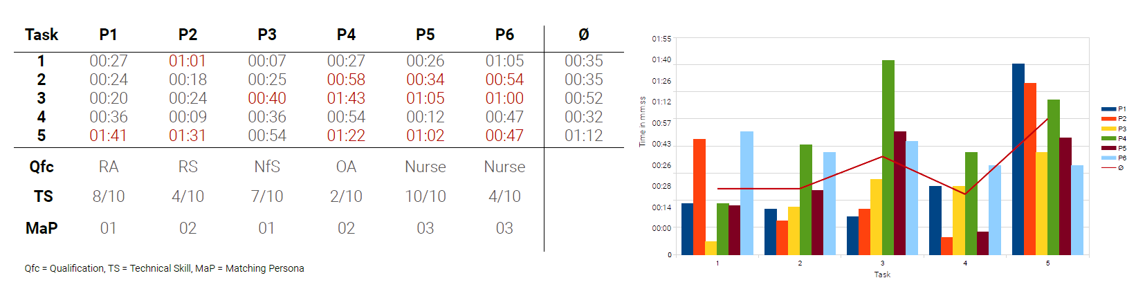
To evaulate the efficiency of the design, the participants had to do 5 different timed tasks. The
severity
of each designflaw was determined by the time the participants took to finish each task and how my users
had
this problem.
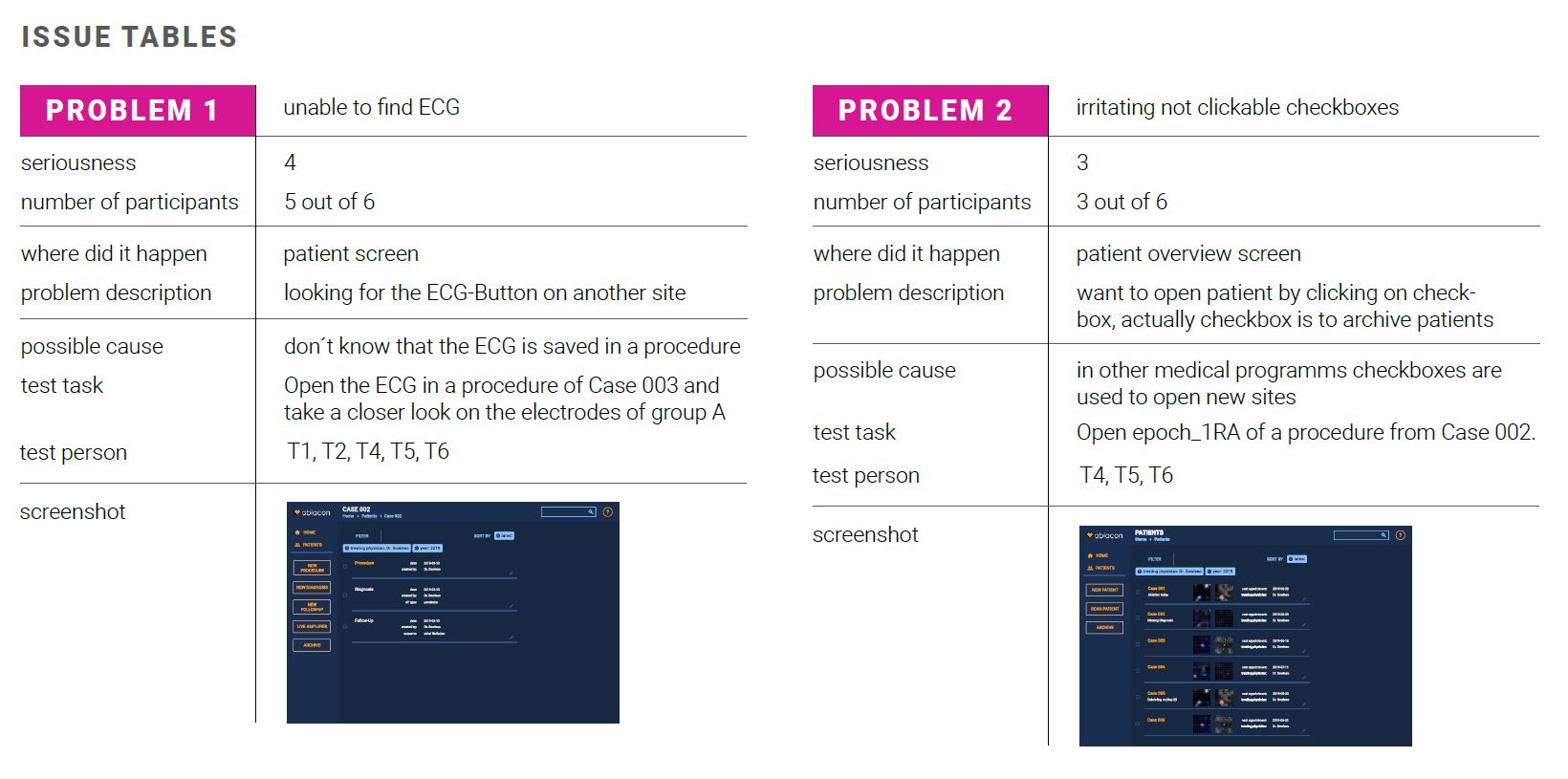
After evaluating each task it was possible to determine wich aspects of the design were easy to use and
where adjustments needed to be made. For that an issue table with all the emerged problems has been
made.
The seriousness (scale from 1 to 5, where 5 is the most serious problem) indicated how sever these problems were.
The seriousness (scale from 1 to 5, where 5 is the most serious problem) indicated how sever these problems were.
FINISHED REWORK


